Your board meeting is tomorrow. Stripe says one revenue number. HubSpot says another. Finance has a spreadsheet that “explains the difference,” except it was last touched by someone who left six months ago. Your COO asks a simple question about net retention, and the room goes quiet because nobody trusts the denominator.
That's the context for automated data processing software in a 20 to 200 person company. It isn't a shiny data-tool category. It's the thing standing between “we think these numbers are right” and “we'll make hiring, pricing, and board decisions off this.”
Teams in this size band don't need another dashboard. They need a system that pulls data from the tools they already run, cleans it, standardizes definitions, and gives the same answer every time someone asks the same business question. If that system doesn't exist, reporting turns into a weekly negotiation.
Table of Contents
- Why Automated Data Processing Software Matters Right Now
- What Automated Data Processing Software Actually Does
- How the Modern Stack Fits Together
- Business Benefits and Real Use Cases for SaaS and Ecommerce
- How to Evaluate Automated Data Processing Software Without Getting Burned
- Common Pitfalls Migration Tips and What to Measure Next
- Choosing Your Path and Getting to Trusted Metrics in 30 Days
Why Automated Data Processing Software Matters Right Now
The problem usually starts small. A founder exports pipeline data from HubSpot. Someone in RevOps combines it with Stripe billing. Finance adds refunds, credits, and a manual adjustment tab. The board deck gets built. Then one director asks why ARR in the deck doesn't match ARR in last month's update.
Nobody can answer quickly because the company doesn't have a reporting system. It has reporting activity.
For years, plenty of teams treated this as normal. They assumed “real data infrastructure” was for larger companies. That view is outdated. Automated data processing software has moved into the mainstream as BI and analytics adoption spread across organizations. One industry summary cites Gartner research showing 81% of business leaders had used BI and analytics software, and 46% had adopted it in just the prior two years, while another market summary says global BI adoption is roughly 26%, with much higher penetration in large enterprises and some markets above 80% according to this business intelligence adoption summary.
That uneven adoption matters. It explains why one company can answer a board question in minutes while another spends half the meeting debating which spreadsheet is current.
The issue isn't reporting speed
Small and mid-sized SaaS teams often describe the pain as “we need faster reporting.” Usually that's not the root problem. The root problem is low-confidence metrics.
Practical rule: If two smart people can pull the same KPI and get different answers, you don't have a tooling problem first. You have a trust problem.
That's why automated data processing software matters now. It creates a repeatable path from raw source data to a number people will use. Not just once, but every week, every month, and under pressure.
What operators actually need
If you're a founder, COO, or RevOps lead without a data team, you don't need a DIY warehouse tutorial. You need clear answers to a few practical questions:
- What this software does: What gets automated and what still needs human ownership.
- How the stack fits together: Where ETL, warehouses, semantic layers, and AI analytics each belong.
- How to buy safely: Which vendor claims matter and which ones are demo theater.
- When not to hire yet: Whether a managed fractional analytics model gets you trusted metrics faster than your first full-time analyst.
That's the useful frame. Trust first. Architecture second. Vendor selection third. Hiring decision last.
What Automated Data Processing Software Actually Does
At a simple level, automated data processing software is an assembly line for business data.
Raw inputs come in from systems like Stripe, HubSpot, Shopify, QuickBooks, and product databases. The software ingests that data, cleans it, maps fields into a common structure, applies business logic, and routes the finished output into reporting and analysis tools.
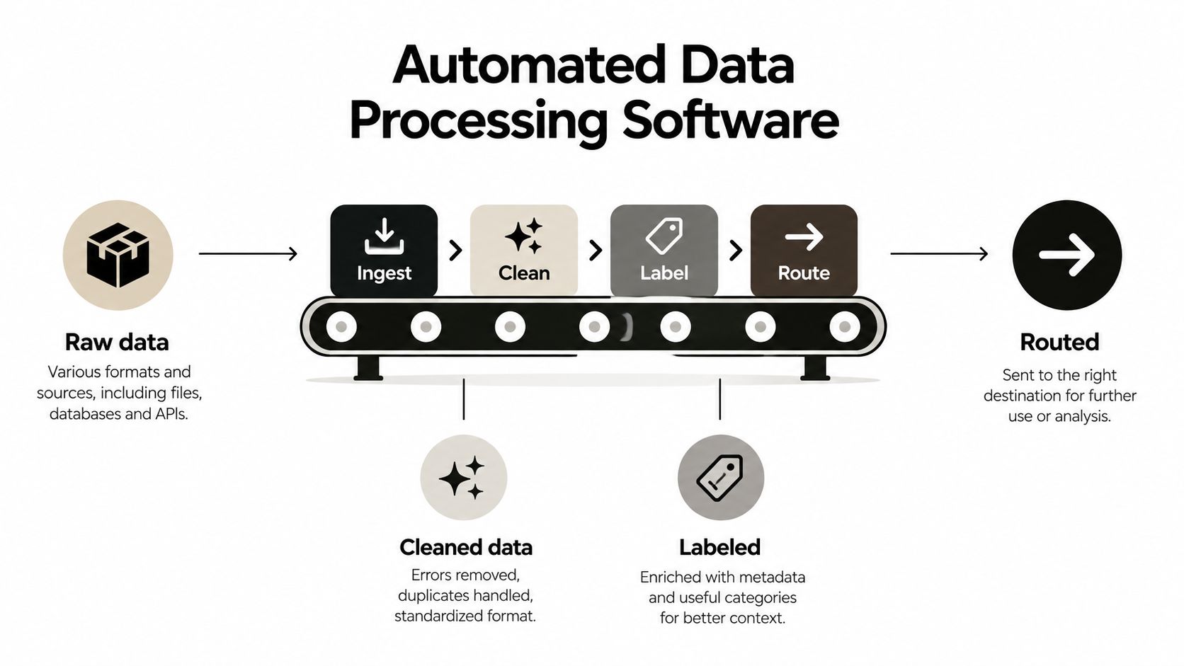
Automated data processing software is the system that moves data from messy source tools into consistent, analysis-ready outputs without relying on manual exports, spreadsheet patch jobs, or one person remembering the logic.
That definition matters because a lot of teams confuse three different things.
It's not just spreadsheets with discipline
Spreadsheets are flexible. They're also fragile. One copied formula, one hidden row, one renamed field, and the board deck changes.
Manual reporting can work for a while, but it breaks when volume rises, source systems multiply, or definitions get contested. You don't want “ARR” to mean one thing in sales and another in finance.
It's not just a BI dashboard
A BI tool like Tableau, Power BI, or Looker sits near the end of the process. It visualizes data. It doesn't automatically solve upstream issues like missing records, inconsistent customer IDs, or different definitions of active customers.
That's why a pretty dashboard can still be wrong.
It's become standard infrastructure
The category has grown fast enough that software volume and spending aren't niche signals anymore. One 2026 market summary pegs BI software at $37.96 billion in 2026 after $34.82 billion in 2025, while another projects the market to reach $150.24 billion by 2034 from $46.42 billion in 2025. The same summary says the G2 Grid reportedly grew from 97 business-intelligence products in 2021 to 237 in 2026, a 144% increase, according to this BI market statistics roundup.
That growth doesn't mean buyers have the problem solved. It means there are more tools than ever competing to sit somewhere in the stack.
What it automates and what it doesn't
Automated data processing software is good at repeatable machine work:
- Pulling source data from apps, databases, and files
- Cleaning and standardizing formats, labels, and schemas
- Joining records across systems
- Pushing outputs into dashboards, models, and reporting layers
It doesn't magically decide what your company means by net revenue retention, qualified pipeline, or gross margin. Humans still own definitions.
If you run ecommerce, even basic finance questions depend on clean processing across orders, fees, refunds, and ad spend. That's why practical resources on how to calculate net profit for TikTok Shop are useful. They show how quickly profitability gets distorted when underlying inputs aren't normalized before reporting.
How the Modern Stack Fits Together
Most non-technical leaders see the modern data stack as a pile of tools. That's the wrong mental model. It's a production system. Each layer has one job, and the whole thing either produces a trustworthy answer or it doesn't.
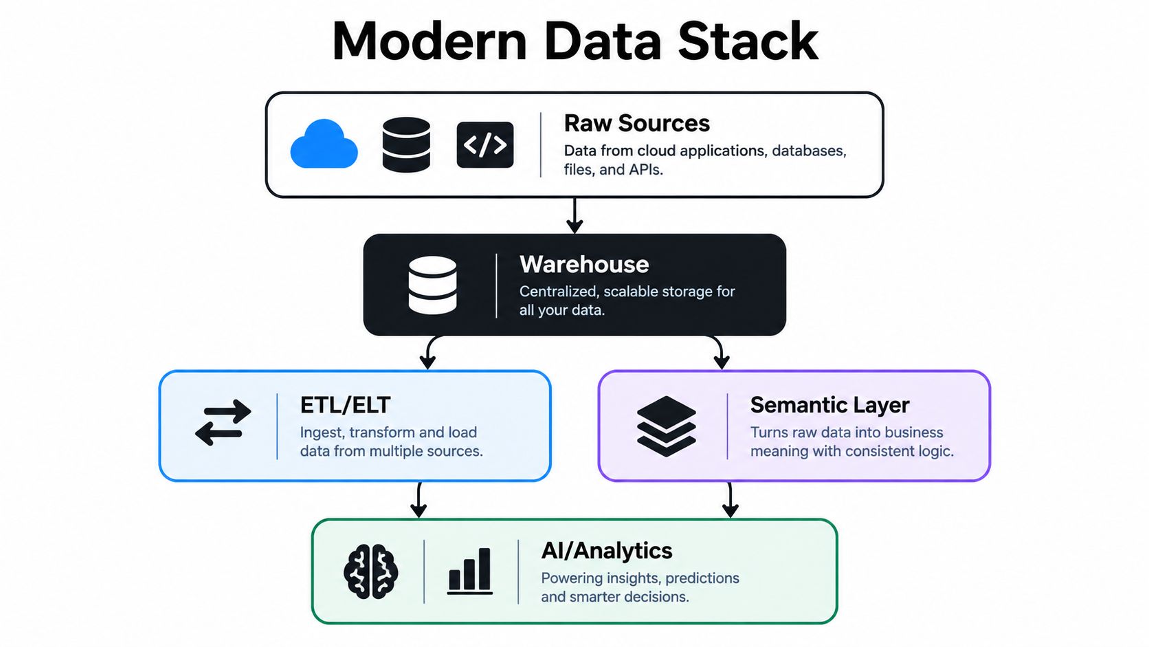
Raw sources and the warehouse
Your raw sources are the operational systems where the business runs. CRM, billing, product telemetry, support, ad platforms, ecommerce storefronts, and finance systems all generate pieces of the truth.
The warehouse is where that truth gets centralized. Not interpreted yet. Just stored in a way that lets the business query it consistently.
If your numbers are still being reconciled across app logins and CSV exports, you don't really have a reporting system. You have distributed evidence.
ETL and ELT move the data
The movement layer pulls data from source systems and gets it into the warehouse. That's the ETL or ELT layer. If you want a plain-English explanation of that part of the stack, this guide on what an ETL pipeline is is the right level for operators.
The important point isn't the acronym. It's whether the movement is reliable.
A lot of reporting failures come from broken handoffs. A connector misses records. A schema changes. A sync runs late. Teams then waste time arguing about the dashboard when the actual failure happened upstream.
The semantic layer is the reliability backbone
This is the layer most buyers underweight. The semantic layer defines business meaning. It's where “ARR,” “active customer,” “gross revenue,” and “churned account” stop being ad hoc interpretations and become shared company logic.
Without that layer, AI analytics is mostly guessing with confidence.
Good agentic BI doesn't start with a chatbot. It starts with stable business definitions.
If an executive asks, “Show me churn by segment over the last two quarters,” the analytics layer can only answer correctly if the semantic layer already knows what churn means in your company.
AI and analytics sit on top, not underneath
Dashboards, self-serve reporting, and plain-English querying live. Vendors love to sell magic. The problem is that output quality depends on the entire workflow, not on the flashiest interface.
A benchmark called KramaBench evaluates automated data-to-insight systems across end-to-end automation, pipeline design, and pipeline implementation because real-world performance depends on the full chain from discovery and cleaning through modeling and analysis, especially in messy environments with multiple input files and unprepared data, as described in the KramaBench paper.
That matches what operators see in practice. The hard part isn't producing a chart. The hard part is orchestrating the entire path to a chart you can defend.
Read the stack in one line
For a non-technical buyer, the stack is simple:
- Sources hold the events
- Movement tools collect and transfer them
- The warehouse stores them
- The semantic layer defines them
- Analytics and AI answer questions from them
If one layer is weak, the whole answer is weak.
Business Benefits and Real Use Cases for SaaS and Ecommerce
Founders rarely wake up wanting automated data processing software. They want fewer reporting arguments and faster decisions they can defend.
That's the business case.
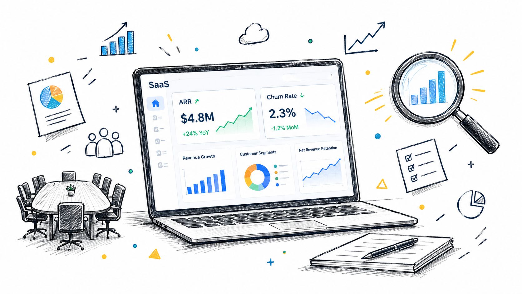
SaaS teams need audit-ready operating metrics
In SaaS, the fast-win use cases are predictable. ARR. MRR movement. logo churn. net retention. sales efficiency. pipeline coverage. board reporting.
Before automation, those metrics live in several places and get reconciled manually. After automation, they come from a consistent system with stable definitions.
That changes operating behavior. The CEO stops asking three people for the “real” number. RevOps stops rebuilding the same board pack. Finance spends less time tracing historical spreadsheet logic.
Ecommerce teams need margin truth, not just sales truth
Ecommerce operators often think they have decent data because order volume is visible. Then they try to answer basic profitability questions across channels and run into a wall.
Revenue is easy to overstate when fees, returns, shipping adjustments, discounts, and ad spend sit in different systems. Automated processing matters because it aligns those inputs before someone reports “profit” with a straight face.
Trust beats speed in smaller companies
There's a reason this matters more now. The trust gap is real. In the 2026 Edelman Trust Barometer, only 33% of respondents globally said they trust business leaders to tell the truth, and the 2026 Precisely State of Data Integrity and AI Readiness found 67% of leaders had high trust in the data their organization uses for decisions, up from 33% the prior year, according to the 2026 Edelman Trust Barometer coverage.
Those are broad trust signals, but they map directly to internal reporting pain. If executives already operate in a low-confidence environment, adding more dashboards doesn't help. It can accelerate disagreement if ownership and definitions are missing.
A fast wrong answer is worse than a slow right one when it drives hiring plans, board guidance, or spend decisions.
A short demo helps here if your team is evaluating how plain-English analytics should work in practice:
The best early use cases are boring
The highest-ROI use cases usually aren't exotic AI analysis. They're operational basics:
- Board reporting: One version of ARR, retention, burn, and pipeline.
- RevOps visibility: Consistent funnel stages and conversion reporting.
- Finance alignment: Revenue and profitability logic that survives month-end.
- Cross-functional answers: The same KPI appears the same way in every meeting.
Boring is good here. Boring means dependable.
How to Evaluate Automated Data Processing Software Without Getting Burned
Teams often approach this category backwards. They start with dashboards, AI query demos, or connector counts. They should start with one question: How does this system earn trust when the data gets messy?
That's the filter.
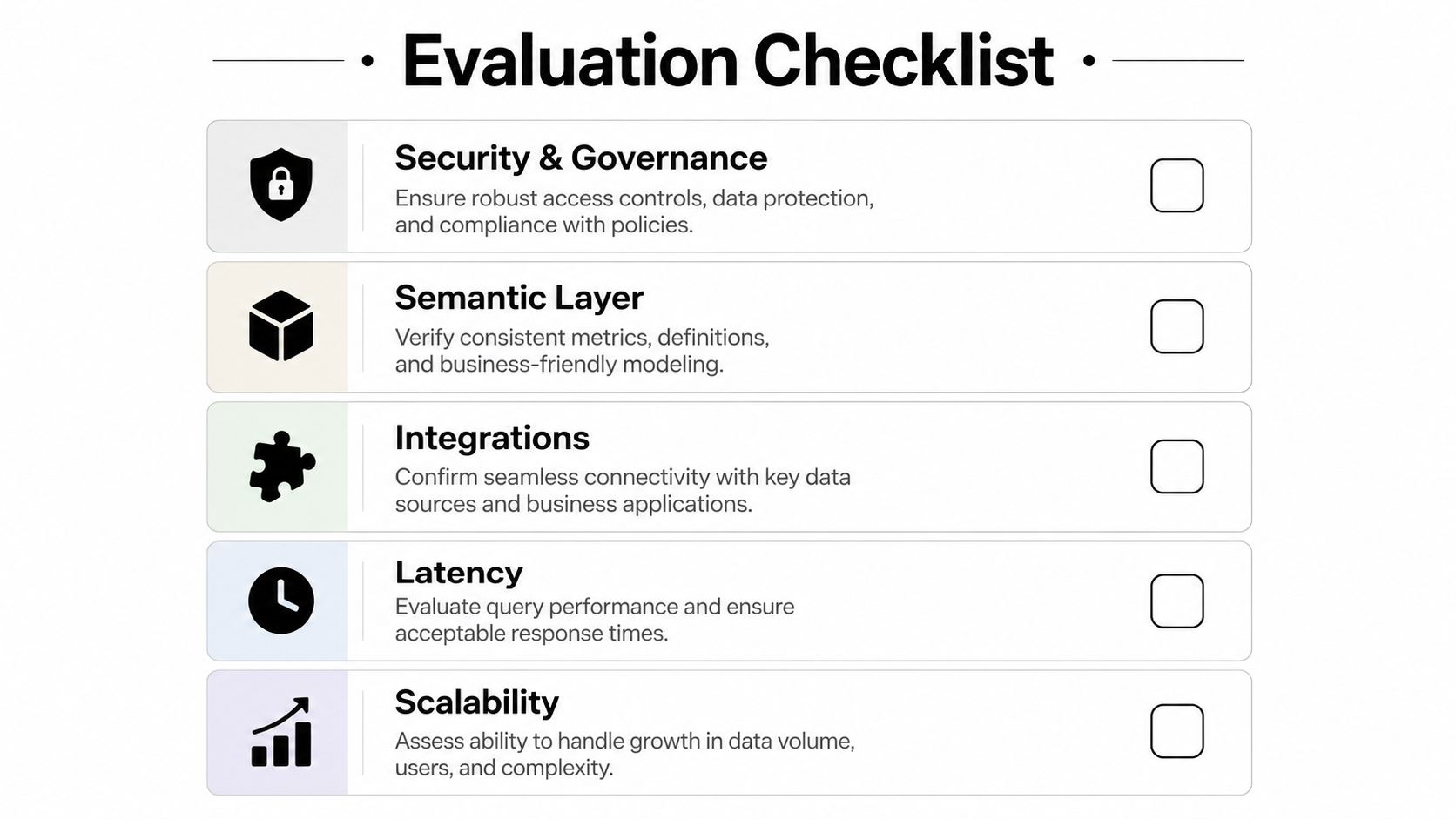
Ask vendor questions that expose the real system
A decent vendor can show a polished demo. A serious vendor can explain what happens when source schemas change, when records arrive late, when two teams define the same metric differently, and when an executive asks why a number changed from last month.
Use questions like these:
- Security and governance: Who can see what, who approves metric definitions, and how are changes tracked?
- Semantic layer: Where do business definitions live, and can finance, RevOps, and leadership use the same definitions consistently?
- Integrations: Which systems are supported in production, not just connected in a sandbox?
- Latency: How quickly does data refresh, and what happens when refreshes fail?
- Scalability: Will this still work when source volume, business units, and reporting needs grow?
If a vendor answers with generic “AI-powered” language, keep pushing.
Evaluation Checklist for Trustworthy Automation
| Evaluation Criteria | What Good Looks Like | Red Flag |
|---|---|---|
| Security and governance | Clear access controls, auditable changes, defined ownership | “Admins can handle that manually” |
| Semantic layer | Shared metric definitions used across reports and AI queries | Every dashboard owner defines KPIs separately |
| Integrations | Stable source coverage for your core systems | Long connector list, weak depth on your critical tools |
| Latency | Predictable refresh expectations and visible failure handling | “It's near real-time” with no operational explanation |
| Scalability | Can support more use cases without rebuilding logic each time | Works for one dashboard, breaks when teams multiply |
Be skeptical of benchmark theater
This category now overlaps heavily with AI analytics. That means you'll hear performance claims dressed up as certainty. Be careful.
A benchmark-focused study warns that overlap between training and test data can inflate measured performance, and another benchmark paper argues that rigor, reliability, and reproducibility must be priorities because benchmark scores can otherwise misrepresent true system quality, as discussed in this benchmark reliability paper. In plain English, some systems look smarter in demos than they behave in production.
That matters because business reporting is full of real-world mess:
- New schemas appear
- Definitions change
- Data arrives late
- Teams ask questions the demo never covered
Buyer test: Ask the vendor to explain how they validate correctness across a full workflow, not just how they render a polished chart.
Don't confuse selection criteria with outcome criteria
A lot of operator mistakes happen because teams evaluate software the way they'd evaluate a feature-heavy app category. They compare screens instead of operating models.
If you've ever researched adjacent infrastructure categories, the logic is similar to careful web scraping vendor selection. The right buying question isn't “which vendor has the longest feature list?” It's “which vendor behaves predictably when the environment gets ugly?”
What good answers sound like
Good vendors usually speak clearly about these issues:
- Definition ownership: They know who decides metrics.
- Failure handling: They can describe what happens when a pipeline breaks.
- Reproducibility: They can show why a number is what it is.
- Cross-functional consistency: They understand that finance and GTM need the same truth.
Weak vendors hide behind interface polish. Strong ones talk about trust mechanics.
Common Pitfalls Migration Tips and What to Measure Next
The biggest implementation mistake is thinking software will fix a definition problem.
It won't.
If your leadership team hasn't agreed on what counts as ARR, churn, qualified pipeline, or contribution margin, automating the pipeline just makes disagreement faster. Move definitions first. Move pipelines second.
The common traps
Most broken reporting projects follow a familiar pattern:
- They automate chaos: Source systems are connected before metric logic is agreed.
- They ignore orchestration risk: Leaders assume ingestion is the hard part and miss refresh failures, model drift, and dependency issues.
- They hire one analyst to fix a system problem: The company expects a single person to untangle source data, define metrics, build dashboards, and educate the org.
That last one is especially common in growing SaaS teams.
Why the first analyst isn't always the right first move
A lot of founders treat the first data hire as the obvious answer. I think that's often wrong for this company size.
The U.S. Bureau of Labor Statistics reported a median annual wage of $112,590 for operations research analysts and $112,650 for management analysts in May 2024, and the 2026 State of Data Integrity and AI Readiness found only 14% of leaders felt their teams had the skills and training needed, according to this automated data processing market report discussion.
That means your “quick fix” is already a six-figure commitment before benefits, recruiting drag, onboarding time, and the fact that one analyst usually can't build an operating model alone.
One capable analyst can be excellent. One analyst is not a substitute for a functioning data system.
If you want the adjacent operating concept, this explanation of data observability is useful because it gets at the monitoring side discovered too late.
What to do during migration
No tutorial here. Just the order that tends to work.
First, align the core metric definitions leadership uses. Second, identify the source systems that feed those metrics. Third, move the logic into a centralized reporting model. Last, expose it through dashboards or AI interfaces.
That order sounds unglamorous because it is. It's also what prevents rework.
What to measure after go-live
Don't obsess over dashboard count. Measure whether trust improved.
Look for signals like:
- Time to board pack: How quickly the monthly reporting package gets assembled.
- Metric consistency: Whether sales, finance, and leadership quote the same number.
- Exception volume: How often someone has to manually adjust or explain a KPI.
- Decision friction: Whether meetings spend less time reconciling data and more time acting on it.
Those are the indicators that tell you if automated data processing software is functioning as operating infrastructure instead of decorative tech.
Choosing Your Path and Getting to Trusted Metrics in 30 Days
Here's the blunt version.
If you have a mature data leader, strong internal engineering support, agreed metric definitions, and enough scale to justify a full in-house build, then building internally can make sense.
If you're a 20 to 200 person company without a data team, that usually isn't your situation. You need trusted metrics quickly. You need somebody to own the reporting operating model. And you probably need that before you need a full-time analyst sitting inside the org.
That's why I'd evaluate the choice this way:
Build in-house when
- You already have leadership bandwidth to manage a data function
- Your source systems are relatively stable
- The business needs a long-term internal platform team
Use a managed fractional model when
- Your numbers currently conflict across tools
- You need board-ready reporting fast
- No one internally owns the semantic layer
- You're considering a first data hire mainly to stop the spreadsheet pain
For teams in that second group, a managed service is often the lower-risk move. It compresses time to value and avoids making a six-figure hiring bet before the reporting model is even stable. One option in that category is HelpWithMetrics, which provides a done-for-you analytics service for companies without a data team and includes work on dashboards, pipelines, and semantic layer setup.
If you're also exploring how AI interfaces sit on top of analytics, this example of ChatGPT Google Analytics is useful context. But don't mistake the interface for the system. The system still needs clean definitions underneath. That's the core reason a semantic layer architecture matters so much for reliable agentic BI.
The right path is usually the one that gets you trusted answers, not the one that gives you the most software to manage.
HelpWithMetrics gives 20 to 200 person companies a done-for-you path to trustworthy reporting without waiting on a full in-house data hire. If you need board-ready dashboards, consistent KPI definitions, and AI-answerable data in about 30 days, visit HelpWithMetrics and book a call. You'll also get a free first dashboard.