You're five minutes from a board meeting. Stripe says MRR is one number, the finance workbook says it's another, and the RevOps dashboard has a third. Churn changed too, depending on which tab someone opened. Nobody is necessarily wrong. Your company has allowed several defensible definitions to become competing versions of reality.
That's why a SaaS metrics dashboard shouldn't be treated as a collection of attractive charts. It should be the operating view that founders, finance, RevOps, and product leaders use to make the same decisions from the same numbers. The principles in this SaaS analytics strategy guide are useful background, but the harder problem is practical: getting a team to trust and use the metrics every week.
Table of Contents
- Why Your SaaS Numbers Never Match
- What a SaaS Metrics Dashboard Really Is
- Essential SaaS KPIs by Audience and Category
- Dashboard Layout and Visualization That Drives Adoption
- The Data and Governance Layer Behind Trusted Metrics
- Example Dashboard Templates and Common Pitfalls to Avoid
- How to Improve Your Dashboard Without Hiring a Data Team
Why Your SaaS Numbers Never Match
A founder usually discovers the problem under pressure. The board asks why net new ARR slowed. Finance opens the billing system. RevOps opens the CRM. Product checks a usage report. Each person brings a number that looks reasonable, and the meeting turns into an argument about definitions instead of a decision about the business.
The disagreement often starts with small choices. Does MRR include discounts? Does churn count a cancelled account immediately or after the billing period ends? Does CAC include sales salaries, marketing software, or only campaign spend? Each choice can be defensible. The failure is allowing each team to make it independently.
Practical rule: If two leaders can answer the same KPI question with different numbers, you don't have a reporting problem. You have a governance problem.
Spreadsheet sprawl makes the situation worse. A weekly export becomes a board tab, the board tab becomes a forecast, and the forecast gets copied into a presentation. Nobody knows which file owns the definition, who approved the formula, or when the number was refreshed. Teams dealing with these conditions should also understand the broader causes described in this guide to data quality issues.
The dashboard has one job
A dashboard exists to eliminate operational ambiguity. It should tell the founder whether recurring revenue is growing, whether retention supports that growth, whether acquisition is efficient, and whether cash gives the company room to act. It shouldn't add another destination that people visit only before a board meeting.
A useful design separates the executive view from functional detail. Founders need a concise pulse on recurring revenue, retention, efficiency, and cash. RevOps needs the revenue movements and acquisition mechanics behind that pulse. Product needs activation, adoption, and cohort behavior. Finance needs definitions that reconcile with the books and a clear reporting cadence.
The right result is not universal access to every metric. It's shared meaning. Leaders should use the same core numbers in weekly operating reviews, forecasts, and board updates, while each function gets the drill-down required to act.
The promise is straightforward: a dashboard matters only when the leadership team runs the business from it every week. If it's opened only to prepare a deck, it's a reporting ornament.
What a SaaS Metrics Dashboard Really Is
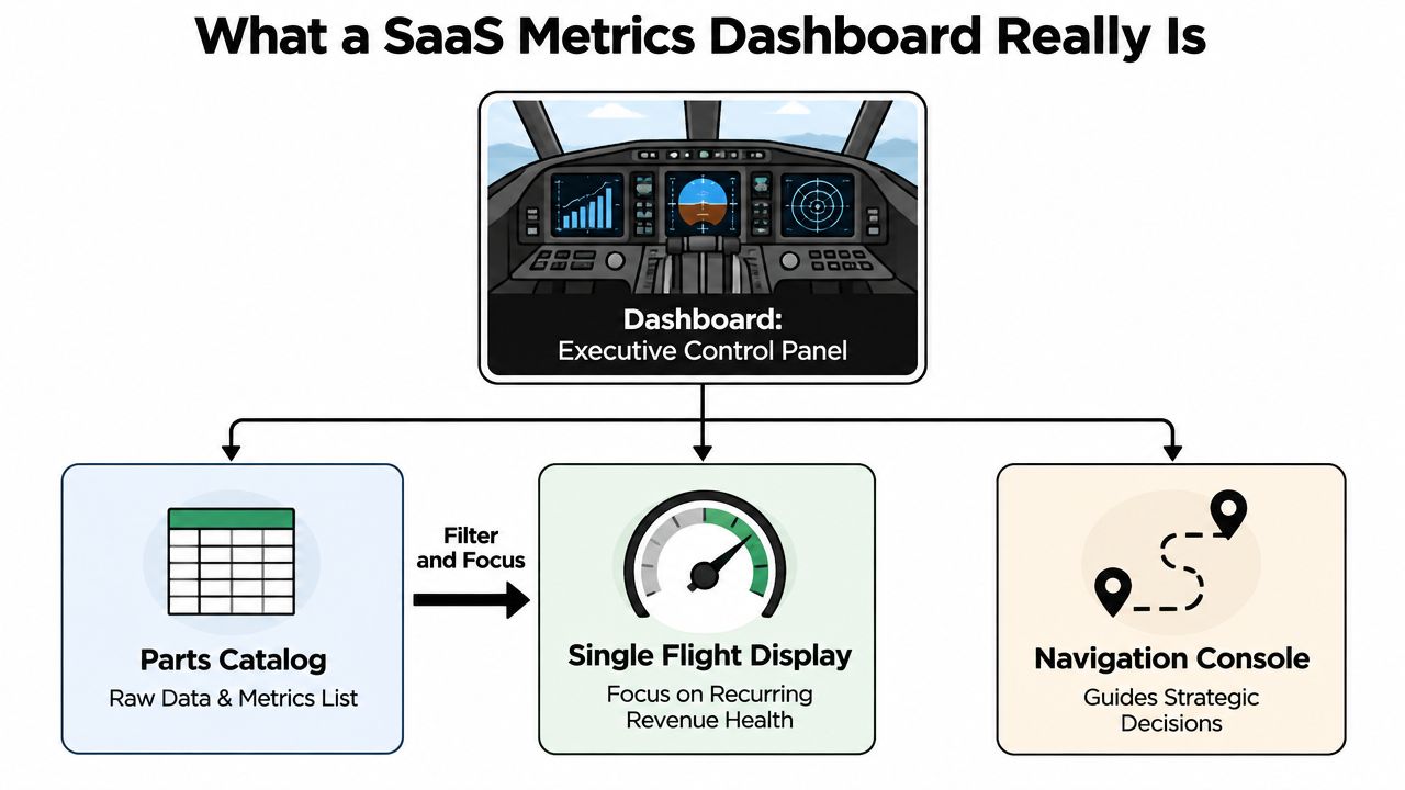
Think of an airplane cockpit. The cockpit doesn't show every component in the aircraft at once. It presents the signals required to keep the flight safe, maintain direction, and respond to changing conditions. Engineers can inspect the parts catalog separately. The pilot needs a focused control panel.
A SaaS metrics dashboard should work the same way. Your warehouse may contain thousands of fields, events, invoices, accounts, and product actions. The executive dashboard should expose a narrow set of indicators tied to recurring revenue health and decisions. It isn't a parts catalog. It's the flight display.
Visibility doesn't create alignment
Dashboard adoption remains a warning sign. One independent 2026 industry write-up reports that only 29% of employees actively use the BI tools their employer pays for, while 87% of organizations report increased analytics adoption. The same source says the active-usage gap has stayed around 29% for seven years, which makes it a persistent operating problem rather than a temporary adoption dip. The industry write-up on BI dashboard adoption provides that context.
The implication is uncomfortable. Companies can buy more analytics capacity without changing how decisions get made. A dashboard can be technically accurate and still fail because leaders don't trust its definitions, can't find the relevant signal, or don't know what action follows from a movement.
That's why visibility must be subordinate to alignment. The important benchmark isn't whether a dashboard exists. It's whether the founder, RevOps lead, and finance owner use the same MRR, churn, and CAC definitions in the weekly meeting.
From BI artifact to operating system
Older reporting environments often rewarded coverage. More charts suggested more analytical maturity. SaaS operators now need the opposite discipline. A practical 2026 SaaS dashboard guide recommends roughly 18 metrics across five categories, revenue, retention, acquisition, efficiency, and cash, rather than an indiscriminate KPI wall. It also identifies the Rule of 40, revenue growth rate plus profit margin, with 40% or higher as the watchpoint. Those definitions and the recurring-revenue operating set are documented in this SaaS dashboard guide.
That narrower model changes the dashboard's role. It becomes a management system for recurring revenue economics, retention quality, and capital efficiency. Charts support decisions, but governance determines whether anyone believes them.
Essential SaaS KPIs by Audience and Category
The executive dashboard should cover a disciplined set of metrics across revenue, retention, acquisition, efficiency, and cash. The categories matter because growth without retention is fragile, retention without acquisition can stall, and both become dangerous when cash efficiency is invisible.
Start with the revenue spine. MRR and ARR show the recurring revenue base. Net new ARR explains how much recurring revenue the business added after new business, expansion, contraction, and churn. These belong on the founder's front page because they answer the basic question, is the company building durable recurring revenue or merely creating activity?
Retention metrics explain the quality of that revenue. Logo churn tracks lost accounts, while revenue churn shows the recurring revenue impact. Net revenue retention adds expansion and contraction to the existing customer base, giving leaders a view of whether current customers are becoming more or less valuable. Product and customer success teams need activation, feature adoption, and cohort retention to identify the behavior behind those outcomes.
Acquisition and efficiency metrics connect spend to results. CAC, CAC payback, pipeline movement, win rate, and conversion help RevOps determine whether the revenue engine is scaling responsibly. Finance needs those metrics alongside gross margin, burn, runway, and cash movement. The founder needs the summary, not every operational slice.
| KPI Category | Example Metrics | Primary Audience | Decision It Supports |
|---|---|---|---|
| Revenue | MRR, ARR, net new ARR | Founder, finance, RevOps | Whether recurring revenue is growing and what drove the change |
| Retention | Logo churn, revenue churn, net revenue retention, expansion | Founder, product, customer success | Whether customers stay, contract, expand, or leave |
| Acquisition | CAC, conversion, pipeline velocity, win rate | RevOps, marketing, founder | Which channels and sales motions deserve investment |
| Product behavior | Activation, feature adoption, cohort retention | Product, customer success | Whether users reach value and continue using the product |
| Efficiency | CAC payback, Rule of 40 | Founder, finance, board | Whether growth is efficient enough to support the plan |
| Cash | Burn, runway, cash balance | Finance, founder, board | How much operating room the company has |
Role-based views beat one giant dashboard
A founder view should answer four questions quickly: Is recurring revenue moving in the right direction? Is retention stable? Is growth efficient? Is cash risk increasing? It should show trends and the major drivers, not every campaign and account.
RevOps needs a different lens. Pipeline velocity, win rate by stage, CAC by channel, payback, and net new ARR belong in its working view. Product needs activation, engagement, feature adoption, and cohort retention. Finance needs cash metrics plus reconciled revenue definitions and the assumptions behind forecasts.
The categories are shared, but the decisions differ. A single dashboard can serve the company only when it provides role-based views over one governed metric foundation. Without that separation, executives get buried in operational detail while functional teams lack the context required to prioritize.
Keep Rule of 40 in context
Rule of 40 is useful because it forces a tradeoff between growth and profitability. It shouldn't replace the underlying measures. A company can reach the watchpoint through very different combinations of growth and margin, so the dashboard must show both components rather than presenting a single score as a verdict.
Ignore vanity metrics: A rising signup count means little if activation, paid conversion, and retention aren't improving with it.
Dashboard Layout and Visualization That Drives Adoption
People adopt dashboards that answer their question before they lose patience. The first screen should establish the current position, the direction of travel, and the reason for any meaningful change. If a leader needs to open six tabs to understand why MRR moved, the layout has failed.
Put the executive summary at the top. Use a small number of headline cards for ARR, MRR, net revenue retention, churn, cash, and the relevant efficiency measure. Each card should include a trend or comparison period, a clear date, and a link to the driver view. A snapshot without context encourages bad conclusions.
Build a visual hierarchy
The middle layer should explain movement. Line charts work well for recurring trends such as MRR, ARR, churn, and cash. Bar charts compare segments, channels, plans, or sales stages. Waterfalls explain the bridge from opening recurring revenue to ending recurring revenue, showing new business, expansion, contraction, and churn. Gauges are appropriate only when a metric has a clear target and the target itself matters.
Cohort views deserve a dedicated place because aggregate retention can hide deterioration in newer customers. A healthy total can coexist with weak recent cohorts. The dashboard should make that tension visible without forcing the executive to reconstruct it manually.
The foundation layer can contain raw data access, exports, and detailed tables. It supports auditability and investigation, but it shouldn't compete with the operating view. Teams looking for further design principles can use this resource on dashboard design best practices, while guidance on KPIs for quality dashboards can help evaluate whether the selected metrics support reliable decisions.
Design for the operating cadence
A weekly operating view needs fresh movements, exceptions, owners, and actions. A board view needs a stable historical narrative, definitions, and concise explanations. A forecast view needs assumptions, scenarios, and a visible connection between leading indicators and financial outcomes. One layout rarely serves all three without role-based navigation.
A useful thirty-second test is simple:
- Find the headline: Can a leader identify the current recurring revenue and retention position immediately?
- See the movement: Does every important number show a trend, comparison, or bridge?
- Trace the cause: Can the reader move from a changed KPI to its segment, cohort, or owner?
- Check freshness: Is the reporting date and refresh status obvious?
- Know the action: Does an exception point to a decision, not just a red color?
The following video offers additional visual context for dashboard structure and use.
The Data and Governance Layer Behind Trusted Metrics
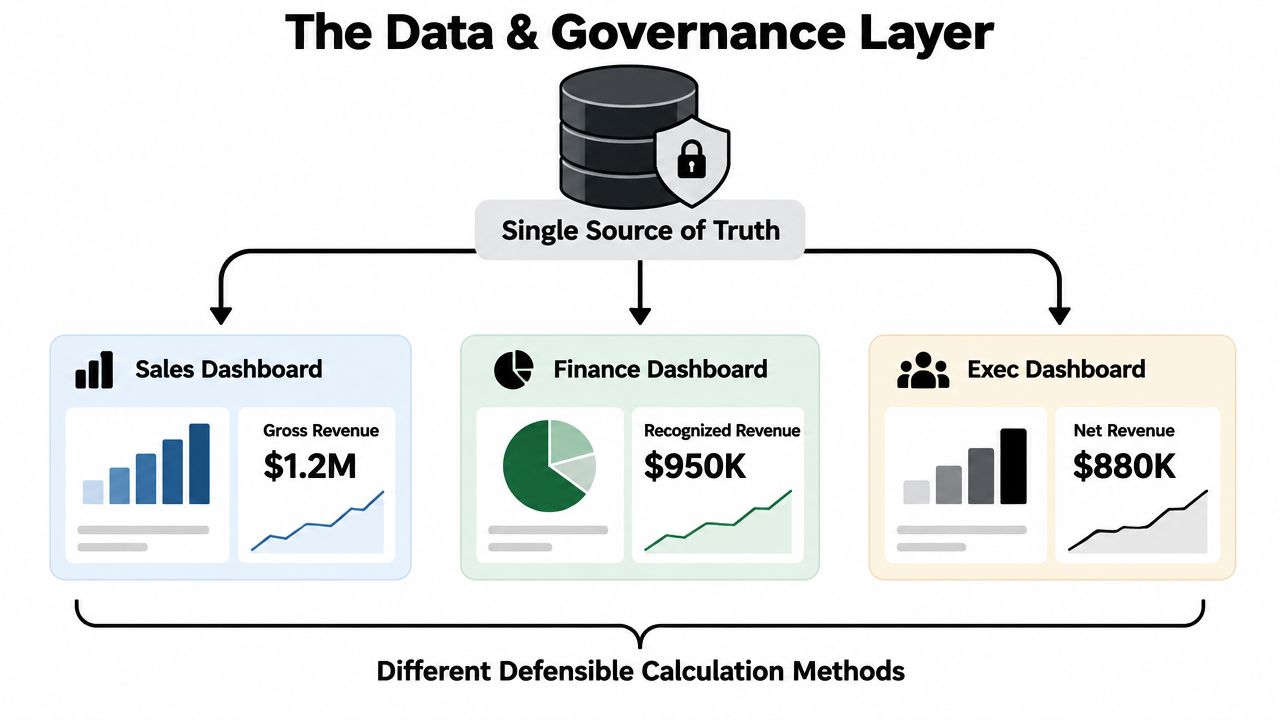
Teams often try to fix dashboard disagreement by adding charts. That's backwards. When finance, RevOps, and product calculate the same KPI differently, another visualization only gives the disagreement a better presentation.
The root problem is that raw warehouse tables don't contain business meaning by default. They contain invoices, subscriptions, events, accounts, timestamps, and status fields. Someone still has to decide what counts as MRR, when churn starts, which accounts qualify as active, and how activation is measured.
The chart is not the source of truth. The metric definition is.
One definition should travel everywhere
A semantic layer translates raw data into shared business terms such as MRR, churn, activation rate, and active account. Instead of embedding separate formulas in every dashboard, notebook, spreadsheet, or AI interface, the organization governs the logic once and lets each consumer query the same definition.
That layer should carry more than a formula. It should include ownership, lineage, policy, and refresh cadence. When a board number changes, the team should be able to identify which source fed it, who owns the definition, and when the underlying data was refreshed. The architecture described in this overview of semantic layer architecture captures the conceptual difference between a chart collection and a governed metrics system.
A semantic layer also makes plain-English analytics viable. A leader can ask why churn increased, which customer segment drove the change, or how activation relates to paid conversion without exposing raw SQL as the interface. The answer is only reliable because the language model is querying governed definitions rather than improvising calculations from unstructured tables.
Governance reduces operating friction
With authoritative definitions, finance and RevOps stop reconciling the same metric in parallel. Board reporting becomes easier to repeat because the reporting logic doesn't change with the person preparing the pack. Product can investigate behavior without redefining the customer population.
The benefit is operational. Teams spend less time comparing spreadsheets and more time deciding what to do about a movement. A named owner can resolve disputes. A stated cadence prevents stale numbers from appearing current. Lineage makes the result defensible when someone asks where it came from.
Agentic BI belongs on top of this foundation, not underneath it. An AI assistant can draft a useful explanation, surface a cohort, or answer a question, but it can't create trust from ambiguous definitions. Without governance, automation produces conflicting answers faster.
Example Dashboard Templates and Common Pitfalls to Avoid
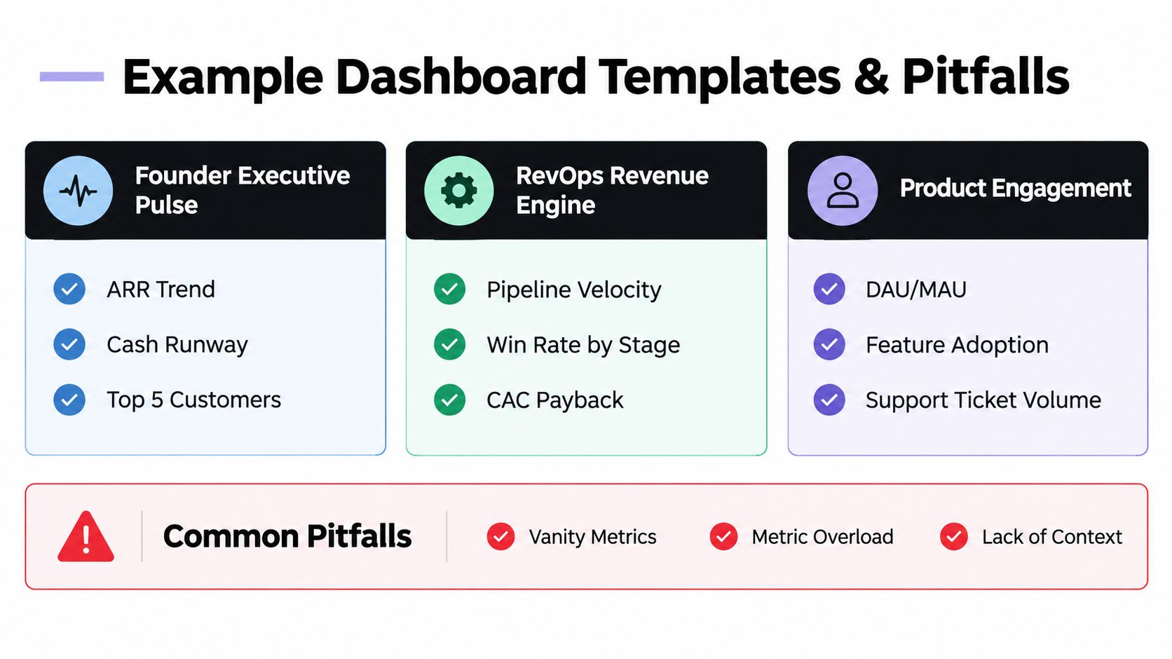
A founder executive pulse should stay deliberately small. Put ARR trend, cash runway, net revenue retention, churn, and the most important customer or revenue movements in one view. Its job is to support the weekly leadership conversation, not replace the finance model or customer database.
A RevOps revenue engine needs more operational depth. It should expose pipeline movement, win rate by stage, CAC, payback, new business, expansion, and the segments behind the results. The decision is resource allocation, which channels, territories, stages, and sales motions deserve attention.
A product retention health view should connect behavior to commercial outcomes. Activation, feature adoption, engagement, support signals, and cohort retention help product leaders identify where customers fail to reach value or stop returning. It should make the path from product behavior to retention risk clear.
Audit the failure modes first
Most broken dashboards show recognizable symptoms:
- Metric drift: MRR or churn uses different rules in finance, RevOps, and product.
- Chart overload: The page contains so many visuals that nobody knows which one drives the meeting.
- Stale refreshes: The report looks current, but the latest data date is hidden or unclear.
- No owner: A KPI has a label and a formula, but no accountable person.
- Missing context: A red indicator shows movement without explaining the segment, cohort, or operational cause.
- Mixed time grains: Weekly, monthly, and quarterly numbers sit together without clear labels, encouraging false comparisons.
Three practical templates
The best template is the one that matches the decision. A founder pulse shouldn't become a RevOps command center. A product view shouldn't force the board to interpret event-level engagement data. Give each audience the right depth, then preserve shared definitions underneath.
Audit question: If you removed half the charts, would the next decision become harder? If not, remove them.
How to Improve Your Dashboard Without Hiring a Data Team
A broken reporting environment doesn't need another month of spreadsheet work. It needs a short path to operational agreement.
Start with the definitions. Finance, RevOps, product, and leadership must agree on what each core KPI means, who owns it, and how often it refreshes. Then establish one governed source for those definitions and make every dashboard view consume it. The first visible milestone is simple: the same MRR, churn, CAC, and retention answers appear across executive and functional views.
The next checkpoint is behavioral. Leaders should use the dashboard in the weekly operating cadence rather than rebuilding numbers for every meeting. After that, board reporting should draw from the same governed metrics, with explanations and refresh dates attached to the numbers.
DIY works while the data sources, definitions, and ownership remain simple. It breaks down when a 20 to 200 person company has several revenue systems, product analytics, CRM data, finance requirements, and no dedicated owner for metric reliability. At that point, the question isn't whether someone can build another Looker Studio, Tableau, or spreadsheet view. The question is who will maintain the definitions, investigate discrepancies, and make the data answerable in plain English.
HelpWithMetrics offers a done-for-you agentic BI service for this operating model, with a semantic layer behind the dashboard and a stated 30-day path to trustworthy, AI-answerable metrics. That can be a more controlled decision than hiring a first data employee before the company knows the exact scope of the role.
Your dashboard is ready when definitions align, one source governs the metrics, the weekly meeting uses it, and the board pack no longer requires manual reconciliation. If those checkpoints aren't happening, stop polishing the charts and fix the system behind them.
HelpWithMetrics builds governed SaaS dashboards for teams that need reliable MRR, ARR, churn, CAC, retention, and cash reporting without assembling a full data function. Visit HelpWithMetrics to book a call and request your free first dashboard.