Most advice about a business intelligence KPI starts in the wrong place. It tells you to pick the right metrics, build a polished dashboard, and connect another data source. That sounds sensible until the board asks why churn in the finance pack doesn't match churn in the revenue dashboard.
A new BI tool won't resolve that argument. Neither will another spreadsheet, a more attractive chart, or an analyst rebuilding the same calculation inside a different report. The problem is usually metric governance, data quality, and ownership. If your business can't agree on what a KPI means, the software is only displaying disagreement faster.
For SaaS and e-commerce operators, trustworthy reporting starts with a smaller question: Can the business explain where each number came from, who owns it, and what decision it should change?
Table of Contents
- The Real Reason Your Dashboards Disagree
- Structural Data Quality Errors That Break KPIs
- Governing Metrics with a Semantic Layer
- Core Business Intelligence KPIs for SaaS and E-commerce
- The Economics of Your First Data Hire
- Building Audit-Ready Reporting Practices
- Securing Your Single Source of Truth
The Real Reason Your Dashboards Disagree
Founders often assume conflicting dashboards mean the company has outgrown its BI platform. That assumption sends teams into a familiar loop: compare vendors, migrate reports, rebuild visualizations, and discover that the same disagreement has survived the migration.
The cause is usually more basic. Marketing defines a customer one way, sales counts another population, and finance applies a different date or revenue rule. Each dashboard can be internally consistent while the organization still has no shared answer. The platform isn't necessarily broken. The business has allowed several definitions of the same KPI to operate without a governing owner.
Dashboard sprawl is a governance failure
A KPI becomes unreliable when people can change its meaning without changing its name. “New customers” might exclude reactivations in one report and include them in another. “Churn” might be measured by logo, subscription, account, or revenue. “Pipeline” might use opportunity creation date, close date, or current stage.
These choices aren't cosmetic. They change the decision a leader makes. A board member asking about retention needs a controlled definition, not a collection of plausible numbers.
Practical rule: If two dashboards show different values for the same KPI, stop debating the values until someone documents the definition, source, filters, grain, and reporting window.
This matters outside SaaS as well. An e-commerce team tracking high-value orders needs consistent attribution, revenue, refund, and conversion rules before it can judge channel performance. A useful tracking guide for high-AOV brands can help teams think through tracking requirements, but tracking alone won't create a common business definition.
Tool-hopping doesn't create trust
Replacing Tableau with Power BI, Looker, Metabase, or another tool may improve usability. It won't automatically centralize business meaning. If every dashboard still contains local formulas and copied filters, the organization has only moved its KPI drift into a new interface.
The durable fix is a single source of truth with named ownership. Business intelligence KPI programs work when leaders can trust that the number is current, consistently defined, and available early enough to support action. Report freshness, metric consistency, adoption, and time to insight are useful foundational measures because they test whether the BI environment is fit for decisions, not whether it contains impressive charts. The UN statistical quality guidance places statistical quality reporting around 16 indicators and treats standard error as a core quality measure, a useful reminder that measurement quality has always mattered more than presentation.
Structural Data Quality Errors That Break KPIs
Dashboard disagreement is the visible symptom. The underlying disease is usually structural data quality failure.
A KPI can change because the source table changed, a filter was applied differently, a duplicate record entered the model, or the dashboard refreshed at a different time. These failures are easy to dismiss as technical details until they delay a close, distort a forecast, or force an executive team to spend a meeting reconciling definitions instead of making a decision.
Where the divergence starts
Common causes include:
- Source-table mismatch: Finance uses booked invoices while RevOps uses CRM opportunity data. Both may be valid sources for different purposes, but they can't answer the same question without an explicit relationship.
- Filter inconsistency: One dashboard excludes test accounts, cancelled orders, internal users, or refunded transactions while another includes them.
- Duplicate or inactive records: A customer, subscription, or opportunity can appear more than once, or remain active in one system after being closed elsewhere.
- Date-boundary differences: Reports may use order date, invoice date, payment date, contract start date, or account activation date.
- Currency rules: Revenue can diverge when reports use different conversion dates, currencies, or treatment of credits and refunds.
- Refresh timing: A dashboard may contain yesterday's CRM data while a finance report reflects a later accounting update.
- Grain mismatch: An account, user, seat, order, subscription, and transaction aren't interchangeable units. Counting one as another creates silent inflation or understatement.
These aren't merely BI inconveniences. The Census Bureau's methodology identifies four primary sources of nonsampling error: coverage, nonresponse, measurement, and processing error. Those categories provide a useful lens for modern operating teams. A missing customer is a coverage problem, an inconsistent definition is a measurement problem, and a transformation defect is a processing problem.
Diagnose the business consequence
The practical test is not whether a data engineer can explain the pipeline. It's whether an operator can explain the business consequence. Conflicting pipeline totals create forecast friction. Inconsistent conversion numbers lead teams to fund the wrong channel. A delayed close leaves leaders using old information while current conditions change.
Recurring defects are common enough to disrupt reporting operations. In Bigeye's 2023 State of Data Quality survey, respondents reported that five or more data issues had occurred during the prior three months. That finding supports a blunt operating conclusion: data quality deserves executive attention because it directly affects the cadence and credibility of KPI reviews.
Teams evaluating their reporting foundation should also consider this practical resource on improving data quality for B2B growth, particularly when CRM, marketing, and revenue data are being combined. For a focused treatment of recurring defects, data quality issues are best treated as a business control problem rather than a backlog item.
Governing Metrics with a Semantic Layer
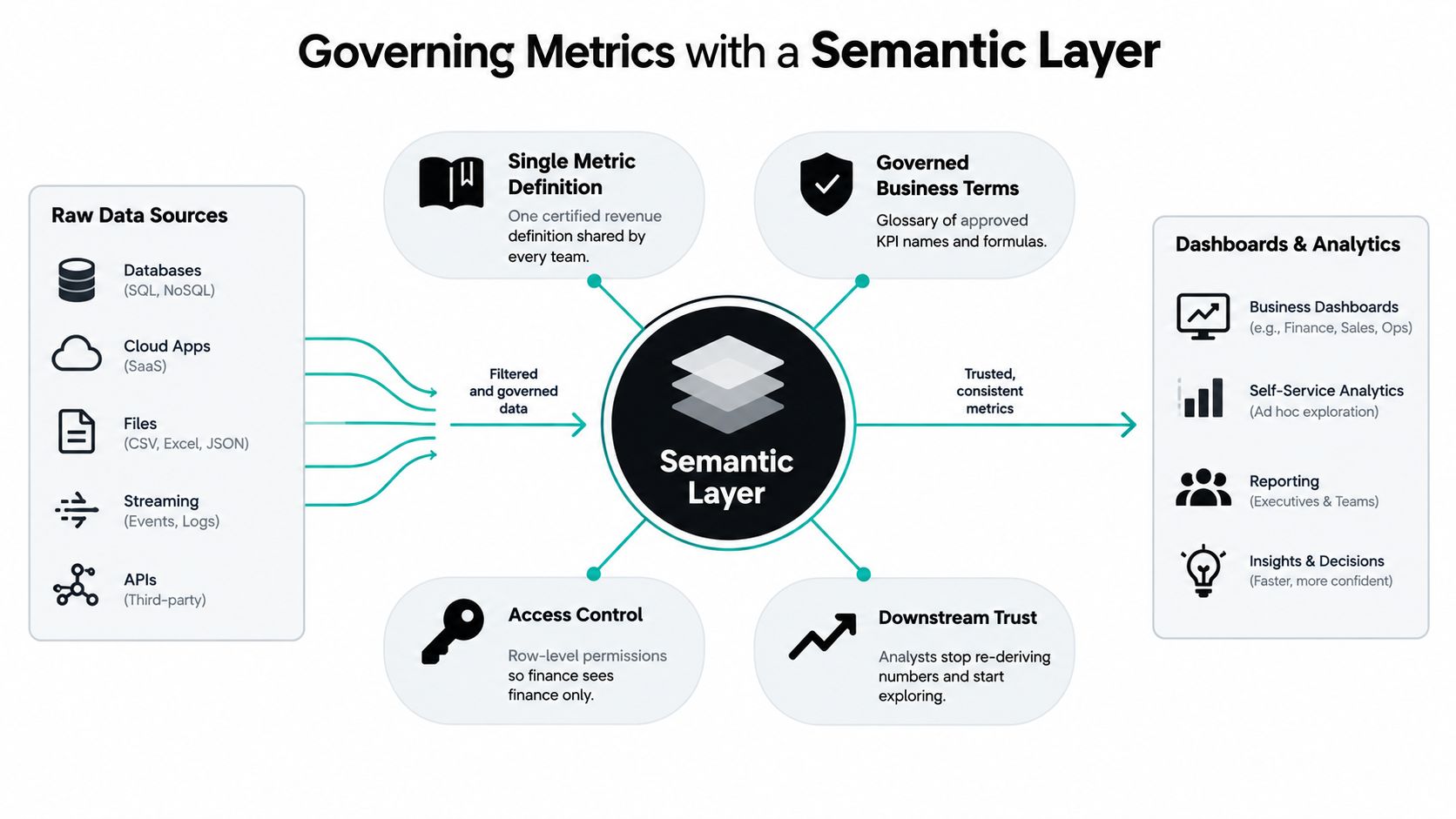
A semantic layer is the business's agreed translation between raw data and reported meaning. It centralizes definitions so dashboards, applications, and AI agents consume the same governed logic instead of recreating calculations independently.
That distinction matters because a dashboard should select and present a KPI, not quietly redefine it. When an analyst adds a local calculated field to fix a report, the immediate problem may disappear while the organization creates another version of the metric.
Define the KPI before displaying it
A production KPI needs more than a name. Its definition should establish:
- Business meaning: What does the metric measure, and why does the business care?
- Calculation logic: Which fields, operations, exclusions, and adjustments are applied?
- Grain: Is the unit an account, user, seat, order, subscription, or transaction?
- Time window: Which dates determine inclusion, and how are boundaries handled?
- Dimensions and filters: How can the KPI be segmented, and which populations are excluded?
- Authoritative source: Which system and fields are approved for the calculation?
- Owner and response: Who explains movement and decides what happens next?
The Snowflake overview of business intelligence describes the value of a governed metrics approach in the same direction: central definitions help multiple teams and BI tools interpret business concepts consistently.
This is not bureaucracy for its own sake. It prevents KPI drift when a new dashboard, reporting analyst, or AI interface enters the stack. Plain-English questions only produce useful answers when the underlying terms have one approved meaning.
Treat the semantic layer as operating infrastructure
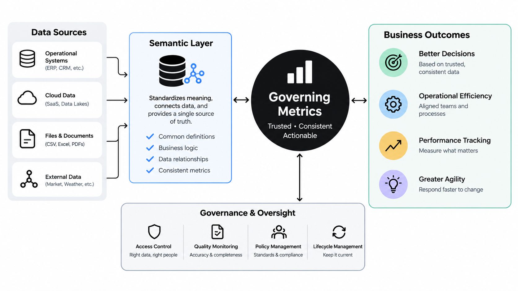
The semantic layer should sit between source systems and consumption surfaces. CRM, billing, product, advertising, warehouse, and finance data can retain their operational roles, while the governed layer determines how the business interprets them together.
That architecture reduces the number of places where a metric can be rewritten. It also gives finance, RevOps, product, and leadership a common reference when they slice the same KPI by period, segment, product, or channel.
A reliable business intelligence KPI is therefore not just a value on a screen. It is a governed object with lineage, ownership, context, and an expected business response. Without those elements, the organization gets faster access to uncertainty, not better intelligence.
Core Business Intelligence KPIs for SaaS and E-commerce
Once definitions are governed, the executive dashboard can become smaller and more useful. The objective isn't to display every available measure. It's to connect a limited set of indicators to decisions about growth, retention, margin, cash, and operational capacity.
For SaaS, that usually means looking beyond bookings and user counts. Net revenue retention shows whether the existing customer base is expanding or contracting after expansion, downgrades, and churn. CAC payback period connects acquisition spending to recovery time. Gross margin churn helps leaders distinguish revenue loss from the economic cost of serving the remaining business.
For e-commerce, traffic and orders aren't enough. Contribution margin per order exposes whether growth creates economic value after variable costs. Inventory turnover connects demand to working capital. Customer lifetime value becomes useful only when its customer definition, order window, margin treatment, and attribution rules are explicit.
Choose decision metrics over attention metrics
A metric belongs on the executive dashboard when a leader can name the decision it informs. Page views may help diagnose demand, but they don't tell an operator whether to increase inventory, adjust pricing, change acquisition spend, or protect margin. A rising follower count rarely settles a board question.
| Metric Type | Vanity Example | Governed KPI Example |
|---|---|---|
| Acquisition | Website visits | CAC payback period with approved spend and customer rules |
| SaaS retention | Total active users | Net revenue retention at the agreed account and revenue grain |
| E-commerce demand | Gross order volume | Contribution margin per order after defined variable costs |
| Product usage | Feature clicks | Expansion or retention indicator tied to the customer lifecycle |
| Reporting health | Dashboard views | Certified KPI usage, freshness, and time to insight |
The table isn't a universal KPI catalogue. It's a filter. If a measure can't be connected to a decision owner, a time window, and a governed source, it may be useful for diagnosis but shouldn't masquerade as an executive KPI.
Make the economics visible
A SaaS leader may accept lower bookings if retention and margin improve. An e-commerce leader may reject higher order volume if contribution margin deteriorates. The dashboard should make those trade-offs visible rather than reward whichever team can produce the most flattering activity number.
The strongest business intelligence KPI portfolios combine outcome measures with operational and data-health signals. Leaders need to know what the business achieved, whether the process can sustain it, and whether the information itself is trustworthy enough to guide the next decision.
The Economics of Your First Data Hire
For a company with 20 to 200 employees, the first data-hire decision is rarely just a question of technical capability. It's an economics and risk decision. The business needs reliable answers, but a full-time analyst may spend the early months learning systems, reconciling definitions, documenting undocumented processes, and negotiating ownership.
A salary comparison understates the commitment. Independent 2026 hiring data places a U.S. data analyst's fully loaded annual cost around $115,000 to $130,000, including more than base salary, according to Stealth Agents' data analyst cost research. Other market guides place a full-time analyst at roughly $120,000 to $227,000 annually, depending on seniority, tooling, and team structure, as discussed in this fully loaded cost analysis.
Compare the actual job to the hiring label
The label “data analyst” hides several different jobs:
- Reporting builder: Produces recurring dashboards and packs, often from existing definitions.
- Data modeler: Resolves source systems, transformations, grain, and lineage.
- Analytics partner: Helps leaders interpret movement and choose actions.
- Governance owner: Maintains definitions, approvals, documentation, and change control.
One hire may not cover all four. If the company expects a new analyst to solve source-system inconsistency, create executive reporting, answer ad hoc questions, and establish governance, the ramp is longer and the role is more expensive than the job title suggests.
A done-for-you BI service changes the resourcing model. Instead of betting on one hire's ability to discover the business and build the foundation, the company buys an outcome: governed metrics, decision-ready dashboards, and plain-English access to agreed data. The right choice depends on whether the immediate bottleneck is long-term internal capability or urgent reporting trust.
A managed service can be lower risk when the priority is trustworthy, audit-ready reporting in 30 days, provided its scope, definitions, access controls, and ownership model are explicit. It isn't a substitute for every future data capability. It is a way to avoid hiring ahead of a clearly defined operating need.
The decision should be judged by time to trustworthy output, not by whether the business has added a headcount. A fast dashboard with disputed numbers is a cost. A governed reporting foundation that leaders can use immediately is an operating asset.
Building Audit-Ready Reporting Practices
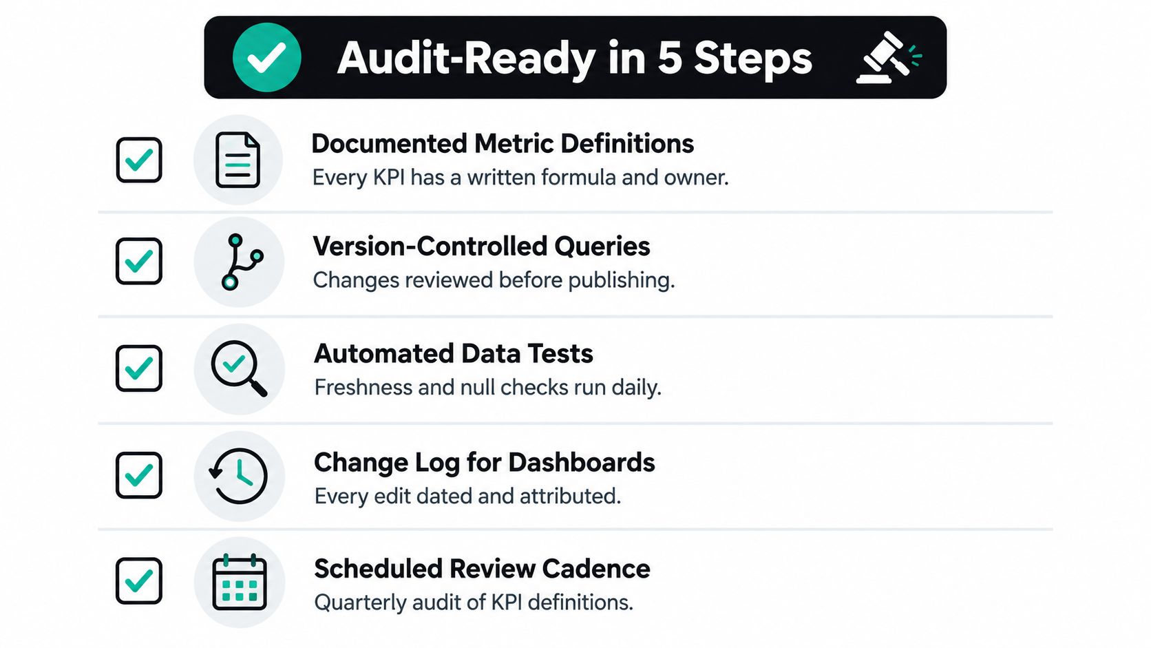
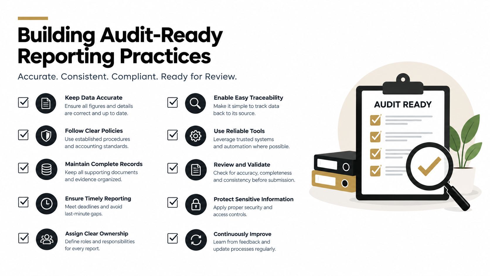
Audit-ready reporting doesn't require a large governance department. It requires visible accountability and enough documentation that a new operator can trace a KPI without relying on institutional memory.
Start with ownership. Every executive KPI needs a named business owner who can explain what movement means and what action follows. A technical owner may maintain the model, but the business owner remains accountable for interpretation.
Put evidence beside the number
A useful reporting record should make these questions easy to answer:
- What does it mean? Write the business definition in plain English.
- How is it calculated? Store the formula, inclusions, exclusions, and aggregation logic.
- Where does it come from? Identify the authoritative system, table, and fields.
- How current is it? State the reporting lag and refresh expectation.
- Who approves changes? Record the owner, reviewer, effective date, and reason.
- What happens when it moves? Link the KPI to a decision or response process.
This evidence should live close to the metric, not in a forgotten document folder. Teams should be able to retrieve the logic during a board review, finance close, investor question, or leadership transition.
A mature program also tracks metric-definition coverage and audit evidence retrieval time. Those measures test whether governance exists in practice. If only some KPIs have documented definitions, or if finding the supporting logic requires a specialist, the reporting system remains fragile.
Keep governance lightweight but real
The best governance model is one people can follow under pressure. Use a small approval path for new executive metrics, a clear change log for formula updates, and a regular review cadence to retire measures that no longer drive decisions. Don't create a committee that delays every operational question.
The Data Hunters Agency analytics guide is a useful reference for thinking about the relationship between analytics, reporting, and business decisions. The operating standard remains simple: when someone asks how a number was calculated, the answer should be immediate, specific, and verifiable.
Securing Your Single Source of Truth
Reliable reporting follows a predictable path. First, identify why the numbers disagree. Then separate definition problems from source and refresh problems. After that, centralize approved logic in a semantic layer, assign owners, and choose a resourcing model that matches the urgency of the business.
The executive conversation changes once those controls exist. Instead of arguing whether finance or RevOps has the “real” churn number, leaders can ask which definition applies to the decision, whether the data is current, and what action the movement requires.
Security belongs in the same operating model. A shared source of truth doesn't mean unrestricted access. The business still needs governed permissions, clear data ownership, and controlled exposure of customer, financial, and employee information. Strong data access control protects trust while allowing the right leaders to work from the same definitions.
The choice between a full-time hire, internal build, and managed service should come after the reporting problem is defined. If the immediate requirement is audit-ready metrics and AI-answerable data, the business should evaluate the path that produces governed answers with the least operational risk.
HelpWithMetrics provides a done-for-you agentic BI service for companies with 20 to 200 employees, using a managed semantic layer to connect agreed definitions to dashboards and plain-English questions. It also offers a free first dashboard, giving founders and COOs a concrete way to assess reporting trust before committing to a broader operating model.
If your board pack, revenue dashboard, and CRM still disagree, visit HelpWithMetrics to discuss your reporting foundation and request a free first dashboard. You'll get a practical assessment of the definitions, ownership, and data quality controls required to make your business intelligence KPIs trustworthy.